


Dashboards are only effective when they deliver the right insights quickly and clearly. For SaaS tools, this means creating designs that cater to diverse users - administrators, decision-makers, and end-users - while prioritizing speed, simplicity, and usability. Here’s what you need to know:
- Users decide in seconds: Dashboards must communicate the most critical insights within 5 seconds. Attention spans are short, and cluttered designs lose trust.
- Key metrics matter: Focus on 5–6 essential KPIs tailored to user roles. Avoid overloading the interface with unnecessary data.
- Design for clarity: Use simple layouts, intuitive visuals, and white space to reduce cognitive load. Stick to familiar chart types like bar and line graphs for better comprehension.
- Mobile-first approach: Dashboards must function seamlessly on all devices. Responsive design ensures accessibility across smartphones, tablets, and desktops.
- Progressive details: Start with high-level data and let users explore further using filters, drill-downs, or linked charts.
- Consistency is key: Maintain uniform colors, labels, and visual styles across the dashboard to avoid confusion.
How to redesign a SaaS dashboard | Speed UX/UI Design
Understanding User Needs for SaaS Dashboards
Before diving into code or sketching wireframes, it’s crucial to understand who your dashboard is for and what problems they need to solve. A CTO monitoring system uptime has vastly different priorities compared to a product manager focused on user engagement. Misjudging these needs can result in features no one uses and critical metrics getting lost in the mix.
Conducting User Research and Mapping User Journeys
Start by talking directly to your users. Even a handful of interviews - just five, according to research - can uncover valuable insights. Ask them about their workflows, what slows them down, and which pieces of information they find truly actionable. As designer Frank Chimero wisely said:
"People ignore design that ignores people."
Card sorting is a simple yet effective way to understand how users naturally group information. Break your dashboard into key data points and observe how users organize them. For example, if users frequently pair "monthly recurring revenue" with "churn rate", it’s a sign these metrics should live side by side on your dashboard.
To make sense of qualitative feedback, use thematic analysis. Tag recurring observations with codes to identify patterns. If multiple users mention they "struggle to locate yesterday’s performance data", that’s a clear theme to address. Dedicate as much time to analyzing feedback as you do to collecting it. Skipping this step risks overlooking insights that could reshape your design.
Mapping user journeys is another essential step. Different personas will interact with your product in unique ways. For instance, a regional manager tracking weekly trends has a completely different workflow compared to a local manager responding to real-time alerts. Mapping these paths helps you pinpoint friction points early, avoiding costly redesigns down the road.
The insights you gather here will guide decisions about which metrics truly belong on your dashboard.
Selecting Key Metrics and KPIs
Not all metrics deserve a spot on your dashboard. Just because data is available doesn’t mean it’s useful to everyone. For instance, sales teams care about Monthly Recurring Revenue (MRR), while analytics teams might focus on Net Promoter Scores (NPS). Displaying every possible number clutters the screen and wastes time.
Stephen Few, an expert in data visualization, defines the purpose of a dashboard perfectly:
"A dashboard is a visual display of the most important information needed to achieve one or more objectives; consolidated and arranged on a single screen so the information can be monitored at a glance."
To design effectively, prioritize metrics based on user needs. Start with the primary question users want answered as soon as they open the dashboard. Make that answer prominent, using bold visuals or large numbers. Secondary details, like regional breakdowns or historical trends, can be tucked into drill-downs or tooltips. For example, if the primary concern is "Are we on track to hit our monthly sales target?" display that number front and center.
Keep the initial view clean by limiting it to five or six key metrics. Use visual hierarchy - such as larger fonts or bold colors for critical KPIs - to direct attention quickly to what matters most. And don’t forget accessibility: with 8% of men and 0.5% of women experiencing color blindness, avoid relying solely on color to differentiate data.
Dashboards typically fall into three categories: operational dashboards for real-time tracking, strategic dashboards for long-term goals, and analytical dashboards for deep data exploration. Tailor your design to fit the specific purpose and audience of your dashboard.
Core Design Principles for Modern SaaS Dashboards
Once you've pinpointed what your users need, the next step is crafting a dashboard that delivers value instantly. With user needs in focus, it's time to lean on design principles that make information easy to digest.
Clarity Over Complexity
Keep it simple. Remove anything unnecessary and design your dashboard to answer key business questions in five seconds or less. The goal is to make it clear without oversimplifying.
Stick to five to nine visualizations per screen. Going beyond this range can overwhelm users and hide the metrics that matter most. As Sisense explains:
"The human brain can only comprehend around 7+-2 images in one time - this is the number of items you want in your dashboard. More than that just translates into clutter and visual noise."
Use layouts like the Inverted Pyramid to organize information. Place high-level insights at the top, trends in the middle, and detailed data at the bottom. Similarly, the F-Pattern layout works well - put your most important KPIs in the top-left corner, where users naturally look first.
Lean on the 80/20 rule to focus on the most impactful 20% of data. If a metric doesn't directly answer a core question, move it to a secondary view or remove it altogether. And don't underestimate the power of white space - it can improve user understanding by nearly 20%.
Responsive and Mobile-First Design
Clarity is important, but so is usability across different devices. Dashboards need to work seamlessly on everything from desktops to smartphones. If users have to pinch, zoom, or scroll horizontally, they'll quickly lose patience.
Responsive design isn't just a nice-to-have; it's essential. It's even a key part of the Web Content Accessibility Guidelines (WCAG), under the "Reflow" criterion. Plus, responsive dashboards perform better in search rankings and match how people work today.
Start with a mobile-first approach. Design for the smallest screen first to ensure you're prioritizing the most critical KPIs. Use fluid grid systems with relative units like percentages instead of fixed pixels, so the layout adjusts to any screen size. Set at least three breakpoints - mobile, tablet, and desktop - using media queries to adapt the layout (e.g., a three-column desktop view collapsing into a single column for mobile).
Opt for scalable vector graphics (SVGs) for icons and other non-photographic elements. They stay sharp at any resolution without adding to file size. Also, make sure interactive elements like buttons and filters are touch-friendly - small touch targets can frustrate users on mobile screens.
Progressive Disclosure and Contextual Information
Start with the big picture and let users dive deeper only when needed. This keeps the interface clean while still giving power users access to detailed data.
Use tools like filters, hierarchies, and drill-down features to manage complexity. For instance, display total revenue upfront, but let users click through for breakdowns by region, product line, or time period. Linked charts can take this further - when users filter or zoom in on one chart, related charts update automatically to provide a broader perspective.
Context matters. A number on its own doesn’t mean much. Always provide reference points like "vs. last month" or "compared to target" to help users evaluate metrics. Use clear titles and labels, and maintain consistency across all visuals - stick to the same colors, spacing, and measurement systems throughout.
Data Visualization Techniques That Work
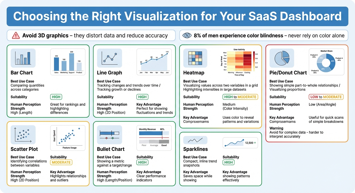
Dashboard Visualization Types: Use Cases and Suitability Guide
A well-chosen visualization can make complex data instantly clear, while a poor one leaves users struggling to interpret it. By following proven design principles, you can transform complicated datasets into visuals that provide immediate clarity.
Choosing the Right Visualization Types
Certain chart types naturally align with how the human brain processes information. Bar and line charts are particularly effective because they rely on length and 2D positioning - attributes we interpret almost effortlessly. Bar charts are ideal for comparing quantities across categories, while line graphs excel at showing trends over time. On the other hand, circular charts like pie and donut charts rely on area and angles, which are harder for us to interpret accurately.
Avoid the temptation to use flashy 3D graphics. They often distort the data and make it harder to judge values accurately. Similarly, linear bullet charts outperform radial gauges because length is easier for the brain to process than angles.
The key is to match the visualization to your specific goal. For example:
- Scatter plots reveal correlations between variables.
- Bar charts highlight comparisons.
- Stacked bars show composition.
- Histograms uncover distribution patterns.
Here’s a quick guide to help you choose the right type:
| Visualization Type | Best Use Case | Human Perception Strength |
|---|---|---|
| Bar Chart | Comparing quantities across categories | High (Length) |
| Line Graph | Tracking changes and trends over time | High (2D Position) |
| Scatter Plot | Identifying correlations between variables | High (2D Position) |
| Bullet Chart | Showing a metric against a target/range | High (Length/Position) |
| Heatmap | Visualizing values across two variables in a grid | Medium (Color Intensity) |
| Pie/Donut Chart | Showing simple part-to-whole relationships | Low (Area/Angle) |
Making Data Easier to Understand with Visual Consistency
Consistency is key when designing visualizations. If you assign blue to represent revenue in one chart, stick to that choice across all visuals. Similarly, keep legends in the same position and use uniform spacing between elements to create a cohesive experience.
Thoughtful use of color can also enhance understanding. For quantities, use sequential color scales - shades of a single color that intensify as values increase. For data with a midpoint, like profit and loss, diverging scales with two distinct colors work best. Keep in mind that around 4.5% of the population (and 8% of men) experience color blindness, so avoid relying solely on color to convey critical information.
Simplify large numbers by abbreviating them - for example, "1.6B" instead of "1,648,745,659.51". To avoid clutter, use tooltips that reveal extra details when users hover over a data point. Always provide context for your data, such as comparisons to previous months or benchmarks, so users can quickly assess performance.
These principles pave the way for more interactive, user-focused dashboards that leverage modern tools like customizable widgets and AI.
Using Customizable Widgets and AI Insights
Customizable widgets allow users to tailor dashboards to their specific needs. By dragging and dropping elements, they can focus on the KPIs that matter most to their role. This personalization helps eliminate unnecessary distractions and ensures dashboards remain relevant to individual workflows.
AI is also revolutionizing how insights are delivered. Instead of requiring users to dig through data for patterns, AI algorithms can automatically detect trends, spot anomalies, and flag unusual activity in real time. For instance, if churn rates are climbing, the dashboard might suggest resources or actions to address the issue. These automated alerts continuously monitor data streams, notifying users of critical events or opportunities without the need for constant manual oversight.
AI-driven personalization goes a step further by tailoring visualizations based on user roles, past behavior, and specific goals. This dynamic adjustment ensures that dashboards provide clear, actionable insights that align with each user's unique needs and responsibilities.
sbb-itb-116e29a
Layout Strategies for Modern SaaS Dashboards
Organizing Information by Priority
When designing a SaaS dashboard, placing information in order of importance is key. Start with an inverted pyramid layout: position the most critical KPIs in the top-left corner - where users naturally focus first - followed by supporting trends and detailed data below or to the right. Keep the initial view clean and manageable by limiting it to 5–6 primary cards. For better readability, use round numbers like "$100K" instead of "$99,842.31" to make figures instantly recognizable.
Card-based layouts are a smart choice for modern dashboards. They offer a modular structure that’s easy to adjust across devices and user needs. Each card can group related metrics, allowing for quick rearrangement of priorities or scaling the interface as required. Generous whitespace between cards helps users focus on one insight at a time without feeling overwhelmed.
These strategies lay a solid foundation for more advanced features, such as adaptive themes and secure privacy measures, which we’ll explore next.
Adding Dark Mode and Privacy Features
Adding dark mode is a simple yet effective way to enhance user experience. It reduces eye strain, especially in low-light environments, and improves accessibility for a broader audience. On the privacy front, prioritize data minimization and role-based access controls to ensure sensitive information is only accessible to the right users. Combine this with seamless security measures like multi-factor authentication (MFA). When users trust that their data is secure and their experience remains smooth, they are more likely to engage deeply with the dashboard.
Comparison Table: Visualization Types and Use Cases
| Visualization Type | Use Case | Suitability | Advantages |
|---|---|---|---|
| Line Charts | Tracking growth or declines over time | High | Perfect for showing fluctuations and trends |
| Bar Charts | Comparing values across categories | High | Great for rankings and highlighting differences |
| Sparklines | Compact, inline trend snapshots | High | Saves space while showing patterns effectively |
| Heatmaps | Highlighting intensities in large datasets | High | Uses color to reveal patterns and variations |
| Scatterplots | Identifying correlations between variables | Moderate | Highlights relationships and outliers |
| Pie Charts | Visualizing proportions of a whole | Moderate | Useful for quick scans of simple breakdowns |
| Tables | Presenting detailed, raw numerical data | Moderate | Ideal for granular comparisons and breakdowns |
Implementation Steps with Scimus Services

6-Step Process for Dashboard Design
Creating an effective dashboard involves a 6-step process that begins with identifying challenges and gathering requirements. This step relies on surveys, interviews, and qualitative research to understand your target users - their roles, goals, and preferences. By aligning these insights with your business objectives, this phase ensures the foundation is solid.
The next stage is prototyping layouts, where designers craft wireframes and interactive prototypes. Typically, they use the Inverted Pyramid structure: key performance indicators (KPIs) are placed at the top, trends in the middle, and detailed data at the bottom. After prototyping, it’s time for user testing. Task-based questions and "think-aloud" methods help confirm that users can easily locate the information they need. As UX Designer Rucha Abhyankar explains:
"Users should be able to identify the information they are looking for within 5 seconds".
Following testing, iterating based on feedback is essential to address any technical challenges before moving forward. Once the dashboard is deployed, ongoing maintenance ensures it stays relevant as data models and user needs evolve. For a smoother implementation, consider hosting a Data Mapping Workshop to align on the data model and prevent future technical hurdles.
By following these steps, you can create a dashboard that effectively meets user needs while achieving business goals.
Using Scimus Services for Custom Solutions
Once the design process is clear, Scimus delivers tailored solutions to bring your dashboard to life. Their expertise includes UI/UX design, web app development, and QA testing, ensuring the final product is both functional and visually cohesive.
- UI/UX Design focuses on creating intuitive interfaces that prioritize user experience and maintain consistent visuals across all elements.
- Web App Development lays the technical groundwork, using responsive grid systems and scalable vector graphics to accommodate business growth.
- QA Testing ensures the dashboard performs reliably under various conditions.
Scimus also offers Application Maintenance, providing ongoing support to address bug fixes, feature updates, and third-party integrations. Acting as an extension of your team, Scimus adapts to industry-specific needs, whether you're in healthcare, fintech, or e-commerce. Their solutions are designed to scale through APIs, pre-built connectors, and robust ETL processes, ensuring your platform evolves alongside your business.
Planning for Continuous Improvement
Dashboards are not a "set it and forget it" endeavor. Regular updates are essential to keep them aligned with shifting user needs and business objectives. Scimus's Application Maintenance service ensures your dashboard stays effective by incorporating AI and automation tools like chat agents, smart search, and process automation. These enhancements reduce manual labor while keeping the interface responsive to new data sources and user feedback.
Periodic reviews also play a key role in refining the dashboard. By revisiting what’s displayed, you can remove outdated elements and improve usability. This aligns with the user testing and feedback principles established during the design phase, ensuring your dashboard remains a valuable tool for your team.
Conclusion
Designing a clear and effective dashboard starts with putting the user first. Research shows that 73% of users consider UX a key factor in their purchasing decisions. By conducting stakeholder interviews, mapping user journeys, and focusing on the right KPIs, you can build dashboards that align with how users actually work. And since users need to absorb key information within just 5 seconds - thanks to an average attention span of 8 seconds - simplicity and clarity are non-negotiable.
The principles outlined in this guide - such as prioritizing clarity, visual hierarchy, progressive disclosure, and mobile-first responsiveness - aren’t just theoretical. They have real-world impact. For instance, over half of mobile users abandon websites that take longer than 3 seconds to load, and usability testing with as few as five users can reveal 80% of potential issues. These stats highlight the importance of combining thoughtful design with technical precision.
To bring these principles into action, it’s crucial to work with professionals who excel in both design and implementation. Scimus exemplifies this approach by offering tailored UI/UX design, web app development, and ongoing maintenance. Their structured 6-step process ensures your dashboard adapts as your business evolves. Whether you're in healthcare, fintech, or e-commerce, having expert guidance allows you to focus on delivering value while ensuring your dashboard remains robust and scalable.
Dashboards are not static tools - they need to grow and adapt alongside your business. Regular updates, AI-driven insights, modular design, and periodic reviews can prevent your interface from becoming outdated or cluttered. The ultimate goal is to create a dashboard that users rely on daily because it empowers them to make faster, better decisions.
FAQs
How can I design a SaaS dashboard that works well for different user roles?
Creating a SaaS dashboard that works seamlessly for different user roles starts with understanding who will use it. Identify key personas - like executives, analysts, or support agents - and focus on their specific needs. Highlight the most relevant metrics for each role, making them easy to find, while less critical data can be tucked away in tabs or collapsible sections. Adding a customizable layout lets users tailor the dashboard to their workflow without cluttering the experience for others.
Another important feature is progressive disclosure, which means showing high-level summaries upfront and allowing users to dive deeper into the details when necessary. Role-based access controls are also essential; they make sure users only see data that’s relevant to them, cutting down on visual noise while protecting sensitive information. Keep the design consistent by using uniform colors and icons, making it easier to navigate between different views. Lastly, test the dashboard with real users. Usability testing helps fine-tune the layout and features, ensuring it meets actual user expectations and supports their workflows effectively.
What are the best practices for creating mobile-friendly SaaS dashboards?
To create a mobile-friendly SaaS dashboard, focus on presenting key metrics right at the top. Use clear typography and a well-defined visual hierarchy to make the most critical data easy to grasp at a glance. Larger or bolder elements can help highlight the information users need to see first.
With limited screen space, progressive disclosure is a smart approach. Display only the most essential metrics upfront, and let users dive deeper via taps, swipes, or expandable sections. A card-based layout works particularly well here - it helps group related data while keeping the design clean and easy to navigate.
For seamless interaction, incorporate touch-friendly elements like large, easy-to-tap buttons, clear icons, and proper spacing between interactive components. Keep charts and tables simple by using concise labels and avoiding overly dense grids that require too much scrolling.
Don’t forget accessibility features to ensure everyone can use the dashboard. High-contrast visuals, readable font sizes, and screen reader support are crucial for an inclusive design. These principles will help you craft dashboards that are intuitive, efficient, and user-friendly on mobile devices.
How can I choose the best visualizations for my SaaS dashboard metrics?
Selecting the right visualizations is crucial for building dashboards that are easy to understand and act upon. Start by considering the kind of data you’re working with and the specific insight you want to highlight. Are you looking to showcase trends, comparisons, distributions, or relationships? For instance, line charts work best for illustrating trends over time, bar charts are effective for comparing groups, and scatter plots excel at showing relationships between variables.
Keep your design clean and to the point. Steer clear of unnecessary 3D effects, overly bright colors, or decorative elements that might distract from the data. Stick to one visual for each key insight to minimize cognitive overload. Also, make sure your charts are formatted with U.S. users in mind - use commas to separate thousands (e.g., $12,345), display dates in the MM/DD/YYYY format (e.g., 12/21/2025), and always include the dollar sign ($) for monetary values.
A good rule of thumb? Apply the 5-second test: if someone can’t grasp the main takeaway of your chart within 5 seconds, it’s time to simplify or pick a more appropriate visualization. A clear, well-structured design ensures your dashboard communicates insights effectively and empowers users to make informed decisions.

